A pie chart is a circular statistical picture graph divided into slices to show numerical proportions. The arc length of each slice in a pie chart is proportionate to the quantity it represents.
The area of the wedge is defined by the length of the wedge’s arc. The area of a wedge represents the percentage of that part of the data in relation to the entire data set. Pie charts are widely used in corporate presentations to provide a brief review of topics such as sales, operations, survey data, and resources.
Pie charts are a common technique to display poll results.
Creating data
# Give some random list(fruits) as static input and store it in a variable.
fruit_lst = ["Apple", "mango", "banana", "orange", "grapes"]
# Give the percentage list as static input and store it in another variable.
gvn_percentges = [20, 15, 40, 10, 15]
How to Create a Pie Chart?
Matplotlib will be used to create a Pie-Chart.
In its pyplot module, the Matplotlib API offers a pie() method that generates a pie chart based on the data in an array.
Syntax:
matplotlib.pyplot.pie(data, explode=None, labels=None, colors=None,
autopct=None, shadow=False)
Parameters
data: The array of data values to be plotted is represented by data, and the fractional area of each slice is represented by data/sum (data). If sum(data)<1 returns the fractional area directly, the resulting pie will have an empty wedge of size 1-sum (data).
labels: It is a list of string sequences that sets the label of each wedge.
colour: The colour attribute is used to give the colour of the wedge.
autopct: This is a string that is used to name each wedge with its numerical value.
shadow: The shadow is utilised to generate the shadow of the wedge.
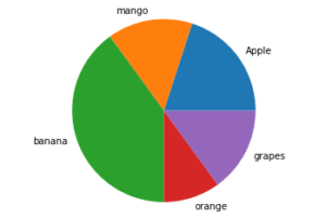
To create a basic Pie-chart, we need labels and the values that go with those labels.
Example
Approach:
- Import matplotlib.pyplot module as plt using the import keyword.
- Give some random list(fruits) as static input and store it in a variable.
- Give the percentage(size) list as static input and store it in another variable.
- Get the subplots using the subplots function and assign it to two different variables.
- Pass the given percentages(size)list, labels to the pie() function and apply it to the above axis (where labels is the fruit list).
- Show the piechart using the show() function.
- The Exit of the Program.
Below is the implementation:
# Import matplotlib.pyplot module as plt using the import keyword.
import matplotlib.pyplot as plt
# Give some random list(fruits) as static input and store it in a variable.
fruit_lst = ["Apple", "mango", "banana", "orange", "grapes"]
# Give the percentage list as static input and store it in another variable.
gvn_percentges = [20, 15, 40, 10, 15]
# Get the subplots using the subplots function and assign it to two different
# variables
figre, axis = plt.subplots()
# Pass the given percentages(size)list, labels to the pie() function
# and apply it to the above axis where labels is the fruit list.
axis.pie(gvn_percentges, labels=fruit_lst)
axis.axis('equal')
# Show the piechart using the show() function.
plt.show()
Output:
Customize a Pie Chart
A pie chart can be altered in a variety of ways. The startangle attribute spins the plot by the provided number of degrees in a counterclockwise direction on the pie chart’s x-axis. The shadow attribute accepts a boolean value; if true, the shadow appears below the rim of the pie. Wedges of the pie can be customized using wedgeprop, which accepts a Python dictionary as an argument and returns a list of name-value pairs specifying wedge attributes such as linewidth, edgecolor, and so on. A frame is drawn around the pie chart by setting frame=True axis. The percentages displayed on the wedges are controlled by autopct.
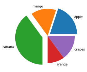
How to Make a slice pop-out?
Using the explode option, you can make one or more pie-chart slices pop out.
To do this give an array with the explosion values. The explosion array provides the fraction of the radius by which to offset each slice.
Example
# Import matplotlib.pyplot module as plt using the import keyword.
import matplotlib.pyplot as plt
# Give some random list(fruits) as static input and store it in a variable.
fruit_lst = ["Apple", "mango", "banana", "orange", "grapes"]
# Give the percentage list as static input and store it in another variable.
gvn_percentges = [20, 15, 40, 10, 15]
#  Give the explode values as static input and store it in another variable.
explode_vals = (0.1, 0, 0.2, 0, 0)
# Get the subplots using the subplots function and assign it to two different
# variables
figre, axis = plt.subplots()
# Pass the given percentages(size)list, explode values, and labels to the pie() function
# and apply it to the above axis (where labels is the fruit list).
axis.pie(gvn_percentges, explode=explode_vals, labels=fruit_lst)
# Show the piechart using the show() function.
plt.show()
Output:
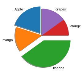
Rotating the Pie-chart
By defining a strartangle, you can rotate the pie-chart.
It rotates the start of the pie chart by the specified number of degrees counterclockwise from the x-axis.
Example
# Import matplotlib.pyplot module as plt using the import keyword.
import matplotlib.pyplot as plt
# Give some random list(fruits) as static input and store it in a variable.
fruit_lst = ["Apple", "mango", "banana", "orange", "grapes"]
# Give the percentage list as static input and store it in another variable.
gvn_percentges = [20, 15, 40, 10, 15]
#  Give the explode values as static input and store it in another variable.
explode_vals = (0.1, 0, 0.2, 0, 0)
# Get the subplots using the subplots function and assign it to two different
# variables
figre, axis = plt.subplots()
# Rotate the pie chart by giving the startangle.
axis.pie(gvn_percentges, explode=explode_vals, labels=fruit_lst,
        shadow=True, startangle=90)
# Show the piechart using the show() function.
plt.show()
Output:
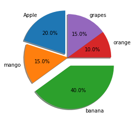
To Display the percentages
# Import matplotlib.pyplot module as plt using the import keyword.
import matplotlib.pyplot as plt
# Give some random list(fruits) as static input and store it in a variable.
fruit_lst = ["Apple", "mango", "banana", "orange", "grapes"]
# Give the percentage list as static input and store it in another variable.
gvn_percentges = [20, 15, 40, 10, 15]
#  Give the explode values as static input and store it in another variable.
explode_vals = (0.1, 0, 0.2, 0, 0)
# Get the subplots using the subplots function and assign it to two different
# variables
figre, axis = plt.subplots()
# Display the percentages using the autopct
axis.pie(gvn_percentges, explode=explode_vals, labels=fruit_lst,
        autopct='%1.1f%%',shadow=True, startangle=90)
# Show the piechart using the show() function.
plt.show()
Output:
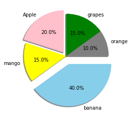
Color customization or Changing
Matplotlib allows you to be creative and make your pie-chart as colorful as possible.
To modify the colors of your pie chart, give the colors list and apply those colors to the pie chart by giving it as an argument to the pie function().
# Import matplotlib.pyplot module as plt using the import keyword.
import matplotlib.pyplot as plt
# Give some random list(fruits) as static input and store it in a variable.
fruit_lst = ["Apple", "mango", "banana", "orange", "grapes"]
# Give the percentage list as static input and store it in another variable.
gvn_percentges = [20, 15, 40, 10, 15]
# Give the colors as static input and store it in another variable.
gvn_colors = ("pink", "yellow", "skyblue", "grey", "green")
# Give the explode values as static input and store it in another variable.
explode_vals = (0.1, 0, 0.2, 0, 0)
figre, axis = plt.subplots()
# Applying the above given colors to the pie chart.
axis.pie(gvn_percentges, colors = gvn_colors, explode=explode_vals, labels=fruit_lst,
        autopct='%1.1f%%',shadow=True, startangle=90)
# Show the piechart using the show() function.
plt.show()
Output:
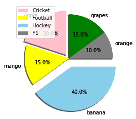
To Display the Color Codes
Along with your pie-chart, you can display a box containing the pie-color chart’s scheme. This is very beneficial if your pie chart has a lot of pieces.
Example
# Import matplotlib.pyplot module as plt using the import keyword.
import matplotlib.pyplot as plt
# Give some random list(fruits) as static input and store it in a variable.
fruit_lst = ["Apple", "mango", "banana", "orange", "grapes"]
# Give the percentage list as static input and store it in another variable.
gvn_percentges = [20, 15, 40, 10, 15]
# Give the colors as static input and store it in another variable.
gvn_colors = ("pink", "yellow", "skyblue", "grey", "green")
# Give the explode values as static input and store it in another variable.
explode_vals = (0.1, 0, 0.2, 0, 0)
figre, axis = plt.subplots()
# Customized pie chart
axis.pie(gvn_percentges, colors = gvn_colors, explode=explode_vals, labels=fruit_lst,
        autopct='%1.1f%%',shadow=True, startangle=90)
patches, texts, auto = axis.pie(gvn_percentges, colors = gvn_colors, explode=explode_vals, labels=fruit_lst,
        autopct='%1.1f%%',shadow=True, startangle=90)
# Display the color codes using the legend() function
plt.legend(patches, labels, loc="best")
# Show the piechart using the show() function.
plt.show()
Output: