Data visualization allows us to analyze the data and examine the distribution of data in a pictorial way.
We may use BarPlot to visualize the distribution of categorical data variables. They depict a discrete value distribution. As a result, it reflects a comparison of category values.
The x-axis shows discrete values, whereas the y axis represents numerical values of comparison and vice versa.
BarPlot with Matplotlib
The Python matplotlib package includes a number of functions for plotting data and understanding the distribution of data values.
To construct a Bar plot with the matplotlib module, use the matplotlib.pyplot.bar() function.
Syntax:
matplotlib.pyplot.bar(x, height, width, bottom, align)
Parameters
x: The barplot’s scalar x-coordinates
height: It is the height of the bars to be plotted.
width: This is optional. It is the width of the bars to be plotted.
bottom: It is the vertical baseline.
align: This is optional. It is the type of bar plot alignment.
Example:
Approach:
- Import matplotlib.pyplot module as plt using the import keyword.
- Give some random list(gadgets) as static input and store it in a variable.
- Give the other list(cost) as static input and store it in another variable.
- Pass the given two lists as the arguments to the plt.bar() function to get the barplot of those lists.
- Show the barplot of the given two lists using the show() function.
- The Exit of the Program.
Below is the implementation:
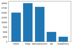
# Import matplotlib.pyplot module using the import keyword.
import matplotlib.pyplot as plt
# Give some random list(gadgets) as static input and store it in a variable.
gadgets = ['mobile', 'fridge', 'washingmachine', 'tab', 'headphones']
# Give the other list(cost) as static input and store it in another variable.
costs = [15000, 20000, 18000, 5000, 2500]
# Pass the given two lists as the arguments to the plt.bar() function
# to get the barplot of those lists.
plt.bar(gadgets, costs)
# Show the barplot of the given two lists using the show() function.
plt.show()
Output:
BarPlot with Seaborn Library
Plots are mostly used to depict the relationship between variables. These variables can be entirely numerical or represent a category such as a group, class, or division. This article discusses categorical variables and how to visualize them using Python’s Seaborn package.
Seaborn, in addition to being a statistical plotting toolkit, includes various default datasets.
The Python Seaborn module is built on top of the Matplotlib module and provides us with some advanced functionalities for better data visualization.
Syntax:
seaborn.barplot(x, y)
Example:
Approach:
- Import seaborn module using the import keyword.
- Import matplotlib.pyplot module as plt using the import keyword.
- Import dataset using read_csv() function by passing the dataset name as an argument to it.
- Store it in a variable.
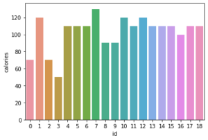
- Pass the id, calories columns, and above dataset as the arguments to the seaborn.barplot() function to get the barplot of those.
- Display the barplot of the using the show() function.
- The Exit of the Program.
Below is the implementation:
# Import seaborn module using the import keyword.
import seaborn
# Import matplotlib.pyplot module as plt using the import keyword.
import matplotlib.pyplot as plt
# Import dataset using read_csv() function by passing the dataset name as
# an argument to it.
# Store it in a variable.
dummy_dataset = pd.read_csv('dummy_data.csv')
# Pass the id, calories columns and above dataset as the arguments to the
# seaborn.barplot() function to get the barplot of those.
seaborn.barplot(x="id", y="calories", data=dummy_dataset)
# Display the barplot of the using the show() function.
plt.show()
Output: