Python Data Persistence – Charts
One of the most attractive features of the MS Excel application is to dynamically generate various types of charts based upon data in worksheets. The openpyxl package has a chart module that offers the required functionality. In this section, we shall see how we can render charts programmatically.

The chart module defines classes for all types of charts such as BarChart and LineChart. The chart requires data range and category range to be defined. These ranges are defines with the Reference () function. It stipulates row and column numbers of top-left and bottom-right cells of the desired range.
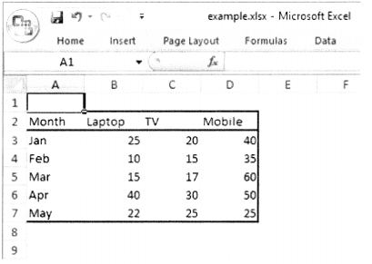
In the above worksheet, B2:D7 is the data range including the column labels, and A1: A7 range is the categories range.
Example
from openpyxl import load_workbook
wb = load_workbook(1 example.xlsx')
ws = wb.active
from openpyxl.chart import BarChart, Reference
values = Ref erence (ws, min_col=2, min__row=2, max_ col=4, max_row=7)
ctg=Reference(ws, min_col=l,min_row=3, max_col=l, max_row=7)
The chart object is configured by add_data() and set_ categories ( ) methods. The add_data() method takes the data range as the first parameter. If the titles_f rom_data parameter is set to True, the first row in the data range is used for the series legend title. The title of the chart, X-axis and Y-axis are also set by respective properties.
Example
c1 = BarChart( )
c1.add_data(values, titles_from_data=True
c1 . title = "Bar Chart"
c1.x_axis.title = 'Months1
c1. y__axis . title = 'Sales'
ws . add__chart (cl, "A10")
c1.set_categories(ctg)
wb. save (filename= ' example .xlsx' )
Run the above script and then open the workbook document. It will now have the bar chart stored in it. (figure 10.7)

Another example of a Line chart is explained below. The chart configuration has only one change. The chart object itself is of LineChart ( ) type.
Example
from openpyxl,chart import LineChart
c2 = LineChart()
c2.add_data(values, titles_from_data=True)#legends
c2.title = "Line Chart"
c2,x_axis.title = 'Months'
c2.y_axis.title = 'Sales'
ws.add_chart(c2, "F2")
c2.set_categories(ctg)
The line chart is stored in the ‘example.xlsx’. Open it to view, (figure 10.8)
